

As you can see, another rural area. The cloister St.Magnus is located on a small hill with some surrounding farmlands, the second pic shows the cloister brewery - every good cloister should brew a good ale, right?
Now, the next one looks rather dull, while it's quite giant. I think you have seen enough grass in all my past pics, so here's ionly the north side of the area, the coastline:

Right, a long beach. Not much to say there, other than that I really hate NWN2's water. I left it out of the screenshot on purpose.
But what I wanted to say about the transitions, super-area like: It's quite a simple trick I first saw in Cipher's A Game of Thrones module, and the actual trick is the wonderful and totally awesome TerraCoppa plug-in. Simply copy the terrain (with all placeables and stuff) from the borders of one area to the unwalkable border of the next one connecting to it, and the transitions are as fluent and seemless as possible with this game. Look at the screenie below:
As you can see, the street behind the transition continues into the distance, you can see those far hills and all. Well, that's exactly what you will see in the next area, copied 1 to 1. It's a huge improvement in game and I wish I had known this trick right from the beginning. It's also a good idea giver for the next area connected - use the transitioning copy&paste on your new empty area and you already have a border of two tiles done, from there you can easier work your way to the next tiles than if you'd stare at a "blank sheet". Wonderful plug-in, highly recommended.
Next some interiors, I know I haven't posted many of these, that's mainly because they usually don't make good screenshots. But as a proof I have some, here you go.
With interiors I'm quite picky, especially the lighting of these is something I often don't like in other modules. Plus, these stupid tiles are just too big. A tavern that mainly is a 4-tile hall, located in one of these tiny buildings, that doesn't look right. Of course the interiors are always too large for the building, whatever you do, but I like to keep it as tiny and realistic as possible.
For example, this is an apartment house floor in Rungholt:

There are 4 apartment doors connected to his , plus two doors for the stairs up and down... all of that is on less than two tiles and I hink it looks okay. If I just used NWN2's default doors and tiles though, I'd end up with a 4x2 tile area your tiny little PC would look totally lost in...
Anyway, some more interiors...


 As you can ee, I tried to make the lighting more atmospheric and realistic than NWN2's defaults - the areas are usually pitch black and only use hand-placed light sources. Furthermore, those have their own little day/night cycle, although I kept it simple. I use the Scripted Lighting System for it which comes with many useful prefabs already that don't need too much work anymore - far easier than making your lights from scratch. And here's what you can do with that:
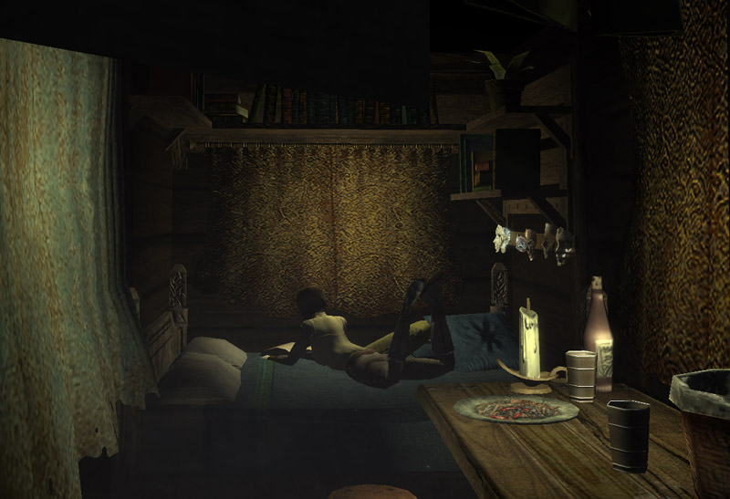
Above is the dawn light: It's not black, but there's a very low blueish light near the curtain, this one is used in the early morning hours and in the evening, for 1-2 hours. In the evening it transitions to pitch black, at which stage a candle is lit on the table (and yes, SLS2 also adds and removes the candle flame effect):
 ... and finally, during daylight hours, the room looks like this:
And below is a van interior, just showing it as another example for a cramped little interior (maybe a third of a tile). Oh, and as you can see, I use Kemo's Animations here - no worries, it'll be the PG version ;)
 Speaking of Kemo's, I also found a way to use these animations on NPCs (they are usually just meant for player characters who fire them via a custom UI). Was a pain to find out how really, but somehow I got it to work:
 Okay, that's enough of screenshots and wannabe-updates that are actually already in for a long while. I'll have to rant a lot too and explain my current lack of inspiration, but that's for another post.
1 comment:
The exteriors look good.
The lighting is lovely(and appropriately dark).
And the kemo animations are just great.
A good update: I know I'm watching. :)
Post a Comment